Sunday, June 19, 2011

The end of the beginning of real life, and the beginning of the very beginning of the middle of real life

Or something like that.

I am officially no longer a student, and instead a self-employed freelancer! Kellan and I will be moving into an apartment into Austin, Texas come August, and until then, I am in a little limbo living with family. It's okay though-- gives me a moment to catch my breath and organize myself.

Clearly, no new art to show at the moment, but I do have a few pictures from festivities at the beginning of June.

At the beginning of the weekend, we attended the Communications Arts show, which was organized by the school and consisted of works from Illustration, Graphic Design, Advertising, and Sequential Art. Here are pictures of Kellan and me with our accepted works:

Me
Kellan

Then, the next night, we had our Illustration Senior Show, which for me was an extremely wonderful culmination of all the relationships, experiences, and growth I have experienced over the last four years in the Illustration department. My parents were able to meet my professors, as well, which was really nice, because they had some very kind words to say about my work. I will miss all those lovely folks from Morris Hall! I only wish I had appreciated the community more when it was readily available.

Me and my work!

My dear friend, Casey Crisenbery

My lovely roommate, Catherine Fontenot!

Aaaand my super-talented love, Kellan Stover

The next day, we turned our tassels and were declared graduates! It was a long, hot, emotional, and overwhelming day that I will never forget and will hold dearly to me for the rest of my life. These people have touched me in so many ways over the years, and I owe them so much. Here are a couple pictures:

Procession into the graduation auditorium.

My school!

SCAD's president, Paula Wallace, and our commencement speaker, Whoopi Goldberg.

The Savannah College of Art and Design Class of 2011.

Kellan and I in our caps and gowns

And again in our fancy outfits


Some illustration loves-- Seo Kim and Josh Heinsz

And now I'm back in Texas! Since then, I have mailed out almost 650 postcard mailers and am an established member of the Square Carousel Illustration Collective-- a group created by Josh (seen above) that consists of 10 cohesive illustration students. Check out our site!

That's all for now! More updates soon. =)
adios
caitlin

Tuesday, May 31, 2011

Okay, I lied...

One last quick post! I graduate in four days... so I'm a tad frazzled at the moment.

My website is 100 percent done and spiffy now!! Go check it out.

Also, did a quick project for my World Mythology class. It is an illustration of the Australian sun goddess, Gnowee, who lights the sky each day with her torch, searching for her lost son. I wanted the piece to acknowledge her despair, but also give a sense of hope. Likely not going in portfolio, but it served its purpose well.


"Gnowee," Gouache, 2011.

Toodles! Next time you hear from me, I'll be a real grown up.
adios
caitlin

Monday, May 23, 2011

One last post as a student...

Can you believe it?!! I'm having a hard time realizing that my entire purpose for the last 18 or so years of my life is now coming to an end. School has been my job, and I have to say, as much as I complain about this or that, it really has been very fun, and I know I'll really miss certain parts of it.

Anyway! Avoiding the emotional and now onto some artwork. Last I left you, I still hadn't received any Getting Published jobs. Well, HOORAY, because that curse has lifted, as I was finally chosen!

First a couple other sketches that weren't picked:


This is for an article in Bay State Parent magazine. The story was about a young woman who loses her beloved family dog. The event makes her realize what she has really lost was that innocent, close relationship she once had with her father. I chose to depict this mourning instead of that of the dog, but the magazine had a more specific other image in mind. I still really liked my sketch for this, though.


For this sketch, we were asked by Crayola partnered with Cartoon Network to create a simulation of chalk-board drawings. The image was to be of a child participating in a sport (we were given a short list to chose from), and then the chosen artist would actually draw this onto a chalkboard, which would then be spray-fixed and not erasable. These chalkboards would accompany the companies as they went on a promotional tour, allowing children to also draw on the board, possibly attempting to re-create our illustration. I was really excited about this job, but unfortunately, my professor did not see my email submission (although I was the first to turn it in, ironically), and it did not make it to the client on time. Completely not my fault, and a big bummer, but I suppose I wouldn't have had much time to spare for the project anyway. I usually don't work digitally, so this was a challenge that I'm happy with the result of.

Regardless, I still won a job with What's Up Annapolis? magazine! The article is about house prices/purchasing/browsing. Four people were chosen to complete a piece (this is the feature article, so we will be spread over several pages), but I was the only one to be asked to complete both of my sketches! What a relief and excitement this was! Here are the sketches:


The first is illustrating housing prices, with the addition of digital color just to help a bit, and the second is showing the concept of "full circle." One day the young family will be old as well, passing their house along to the next generation. The circular composition is intended to help this idea along.
And here are the finals!


"House Prices," Gouache and Digital, 2011.

"Full Circle," Gouache, 2011.

I kept with the same color palette intentionally. Hopefully they will be placed near one another in the article, which will be out in September, by the way!

In other news, I've pretty much wrapped up creating all my self-promotional materials. Here are a few pictures of it looking all fancy together:

Mailer list, promo envelopes, postcards, business cards, and portfolio.

Postcards and business cards

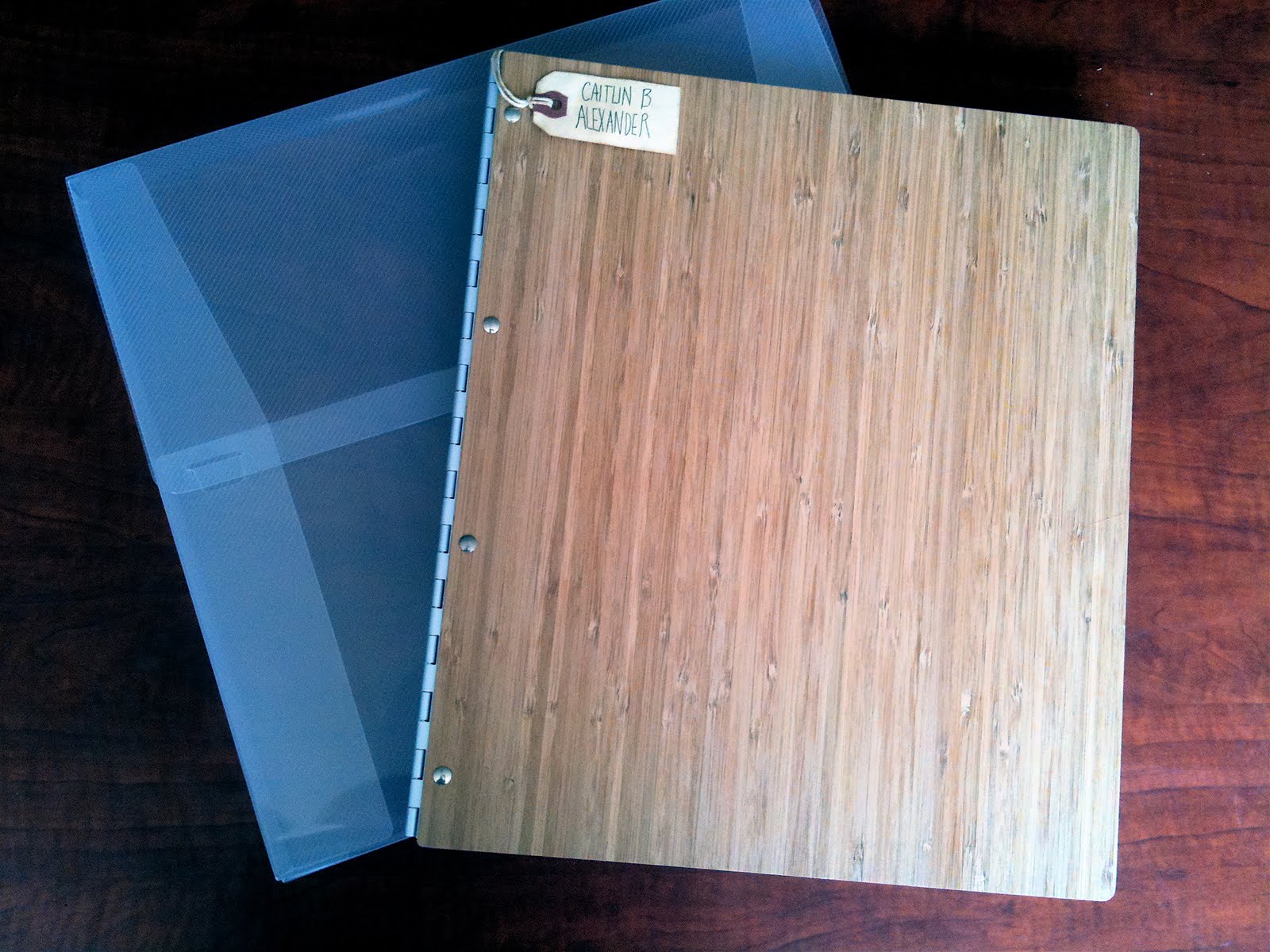
Portfolio exterior and case (so pretty!)

Portfolio first page (my prints all look great, for once! Thank you Gulfstream!)

Another portfolio page, showing the design layout.

My little name tag. =)

Now I am officially professional! Also, quick news: I got my "Rabbit" piece back from Hong Kong, safe and sound, and lookin' good in the frame (which I never saw before!). Finally, I am officially in the 100 Sketches From Life Club from last quarter's Portfolio class.

Oh! And how could I forget? My painting for the mural, which seems like it unfortunately won't happen. Or, at least while I'm in Savannah.


"Counting Mural," Gouache, 2011.

And the last announcements for the day: Thursday, June 2nd and Friday, June 3rd are the senior shows I'll be participating in. Thursday is the Communication Arts Senior Show, and Friday is the Illustration Senior Show. If you're in Savannah, ask me for directions and stop by! There will be lots of pretty art to see.

As you may have noticed, this blog is looking a whole lot spiffier lately! Keep an eye for an updated site sometime soon too...

That's all for now!
adios,
caitlin

Thursday, May 5, 2011

Happy Cinco de Mayo!

I have a fiesta of artwork to show you! (teehee)

First off, I finished the Dog Sees God poster, which was not chosen, as they preferred something a bit more humorous. It'll still make for a great portfolio piece, though, so I'm okay with it.


"Dog Sees God," Gouache and Digital, 2011.

Next, a couple more sketches (which also have not been chosen to get published. I am keeping my fingers crossed for some upcoming projects, though). They were for a story in Charleston Magazine, in their "Southern View" section. The text is about a woman who is not from the south, and cannot tolerate the snakes around her new home. She describes them as the "pink elephant in the room" because the locals never discuss their existence. We were told to create either a sketch of a snake on an elephant's back, or the snake as a garden hose, and I chose to do both.


I am working on sketches for two more projects, but haven't finished yet, so keep an eye out for them next time! There is one more sketch though, for the SCAD Illustration Club. We have been asked to create murals in the Children's Hospital, and this is a concept for one of the walls. The project has been postponed a little due to lack of participation, but I really hope we are able to follow through with it.


The idea is to create a subtle counting interaction with the patients, with one monster on the left, two boats in the middle, and three umbrella characters on the right. The flowing from one portion of the piece to next is also intended to be somewhat comforting and intriguing, keeping the child interested and distracted. I'll keep you updated on this project, too.

Next up: I've been working hard in my self-promotion class! First item of completion (other than my artist statement and logo, which I've already shown you) is my business card! I'll be ordering these today, likely, which means I should have them in a week or two.

Here's the front:


And the back (the image is from my "Restless" album cover project a couple quarters ago):


Next, I finished my resume! It looks much more professional than my old one.


You can click on the image to make it larger.

And last, but not least, I finished my postcard mailer! The artwork is original for the card, and I wanted to include as many of my illustration themes as possible: kids, adults, cat-people, birds, houses, patterns, flowers and trees.


"Welcome to the Neighborhood," Gouache, 2011.

I may need to tone the color down a bit before I send it off to get printed (which should be today!) Here is the backside:


On the white background of this blog, it may be difficult to tell what is happening here... But the edges are a quarter inch away from the text in the top left corner, if that helps at all.

Anywho, one last bit of AWESOME news for today-- Kellan and I won first place group at the Sidewalk Arts event last weekend!! I was so excited and surprised. And thankful for the money! Here are a few pictures.


This is our piece! Kellan worked on the two kids, and I did the monster, birds, and ground. We painted the background together (Kellan added that bit of sky at the top, too). This image was taken by SCAD and is on their website. Just look at the bottom to scroll through the winners.


Our first place sign!


Proud parents


Kellan working diligently.


And this is me!

I believe that's all the news I have for you at the moment. Sometimes it's hard to keep track, with so many things going on at once as we close in on graduation. I got my work printed and framed yesterday for the senior show, and will next be working on my new website and portfolio book. Phew! It's going to be an intense four more weeks.

That's all for now,
adios
caitlin

Thursday, April 21, 2011

Sketches, Sketches, and More Sketches

So many sketches and so little time! I've actually completed only one true piece so far this quarter, but I've been very busy drawing, and drawing, and drawing some more, for my Getting Published class. Unfortunately, I haven't been picked for an assignment yet, but I will keep working progressively harder until I do!

First off though-- other news:

I attended an event last week called the Bandwagon Poster and Record Fair, where there were tons of band posters for the taking (er, buying mostly. But inspiring too!). Most of the work was hand screen-printed, which I found especially inspiring. Methane Studios was probably the best booth there. I actually have already posted about them before, because they had a show in Alexander Hall a few quarters ago.

There is a slew of upcoming events in Savannah in the next couple weeks that I am participating in, including the Sidewalk Arts Competition, Sand Arts, and a few things unrelated to art, such as an Iron and Wine concert! It's going to be so, incredibly busy, but it doesn't phase me one bit. And then...

GRADUATION! We are headed into week five after this weekend... which means only five weeks after that. I'm not sure if the shock has hit me just yet.

Anywho, I forgot to mention in my last blog post that I got a little something in the mail a little while ago:

Now I'm all fancy and official and such! I'm not sure why they gave me four, when I only had two pieces, but I'm not going to complain.

Onward! In Self-Promotion, we have written an artist statement, created a logo, and are now preparing postcard mailers and business cards, which will be followed by a new website (hooray!). Here are my logos (one in color and one in black and white):


You'll be seeing a lot more of this little guy in a few weeks, when I revamp my site, and yes, blog too. It's in dire need of a makeover!

Finally, it's time for a big pile of sketches. First off, the class worked on posters for the upcoming SCAD theater production of "Hair." We were all to take the piece to finish, so the director and his creative crew could understand what they were choosing. For our sketch critique, the director came in to see our work. He surprised everyone by disliking most of what he saw, and contradicted his posted requirements as well as our own aesthetics. It was a very much a learning experience: you never know what a client will want from you. He made it pretty clear that he did not like "cartoony" work, so I created my final knowing full well that it wouldn't be selected. I was perfectly alright with this, since it will just become another portfolio piece. Here are my sketches and final:


"Hair" Gouache and Digital, 2011.

Next, we were asked to create an illustration for WNC magazine to accompany an article describing the beautiful scenery of North Carolina, and how the author preferred her own porch to leaving for a vacation. I completed two sketches of the same subject matter, focusing on the symbolism of the suitcase and Hawaiian lei. I think the reason this wasn't chosen was because the scenery was not shown enough. Understandable!


And most recently, we are working on two assignments at once (he said one was optional, but I guess I'm an overachiever). First, another theater poster, this time for the play "Dog Sees God," which is a peculiar parody on the Peanuts characters, grown up and in high school. The plot focuses around teenage problems such as drugs, sexual orientation, bad behavior, bullying, and suicide.


This is the image I'll be taking to final. It is implying the relationship between two characters, as well as the contrast of hope and depression between them.


This sketch is a more narrative representation of the play, as the "Charlie Brown" character is mourning the death of his dog, "Snoopy." (I put these names in quotes because the play doesn't actually use most of the Peanuts names, as agreed between the author and Charles Schulz).


I wasn't sure if I was taking the play as too seriously, so I drew a more lighthearted image of raining peanuts with cuter lettering. My professor said he saw Jesus' face in the imagery... still not sure if I'm on the same page with him there.

Keep an eye out for a post with the "Dog Sees God" final poster!

And last, but not least, my sketch for the Savannah Green Guide: a pamphlet that will be distributed which explains eco-friendly ways to create an event. Kellan actually illustrated their last edition:

©Kellan Stover

You can download the PDF at their website. He also did the little spots on the inside!

Here's my sketch for what will hopefully be the next edition (the pressure is on, since Kellan already got it! If I win, we will be the ultimate illustration power couple! haha, just kidding of course!):


Also, I just sent in four submissions to the SIC Senior Show. Hopefully I'll get all of them in, so I can have a greater presence there. If not though, I'll still be entering more work in the Communication Arts show, which also includes Sequential Art, Graphic Design and Advertising.

That's all for now!
adios
caitlin

Tuesday, April 5, 2011

My Last First Post of the Quarter

MAnd then I am no longer in school!

These classes will be an excellent way to wrap up my education. They are challenging, yet fun, and scary, yet exciting. I'm in my last English class of my life-- World Mythology-- which, so far, has been especially entertaining. Our book, "The Friendly Guide to Mythology," has short explanations of stories passed down in cultures across the globe and over the centuries. Some of them are surprisingly crass. Here is a short excerpt that had me laughing:

"The Narrinyeri of Southern Australia, an irreverent group, say that the Creator used excrement to form human beings. Afterward, he tickled them until they laughed and thus he brought us to life."

Now, is that how he did it? Funny we don't smell worse...

Anyway, not too much to show yet for my other two classes. In Getting Published (where we have actual clients and compete for the assignment), I have yet to be picked, but I do have a few sketches to show.


Worcester Sketch 1, 2011.


Worcester Sketch 2, 2011.

These were two different concepts (with the masthead mock-up) for Worcester Magazine's poetry contest special cover. The first is of the concept "word garden." The second is playing off of the idea of the metamorphosis of poetry. Neither were picked to take to final.

Charleston sketch, 2011.

For this piece, we were told exactly what the client (Charelston Magazine) wanted for their story on a trip through Italy: a spot of a couple walking down a path Wizard of Oz-style, holding a basket with salami and bread, and also some wine. The Italian hills would be clear in the background, and the path would be lined with Cyprus trees. Where they are stepping, the path turns into a map of Italy, with their destination of Spoleto clearly marked. It was a challenge! Even though I wasn't picked for this assignment either, I was pretty happy with my sketch.

And in Self-Promotion, we have only completed our Artist Statements (logos are in progress), so here goes:

Many people are bound to simply dream of exploring a career they are truly passionate about. I chose, a long time ago, to take the risks of pursuing that fantasy, and at this point, I could never imagine myself doing anything but illustration. Living through eyes trained to see aesthetics is a privilege that makes the world instantly more sentimental and filled with magic. My goal is to bring that sentimentality to others, that simple beauty which four years of art school has trained me to capture from my everyday life. More practically speaking, my goal is also to live a modest, comfortable, cozy, and colorful life creating illustration that, to be put most simply, makes people happy.

As I create any illustration, I always try to keep in mind my inspirations and references. I am continually looking to art created by illustrators in the 1950s and ‘60s, such as Disney concept artist Mary Blair, taking note of elements of the work that are still pleasing today. I also often reference current artists inspired by the same era, including Matte Stephens and Peter Brown. Following the research, my creative process moves quickly from start to finish. During the sketching stage, I hammer out important aspects of the work, such as composition. The character of my illustration truly lies in the color selections and handling of paint, however, where I spend the majority of my time. These are things that grow naturally as I work, and if I see the development as unsuitable for the assignment, I will likely start the piece over again. It is a priority of mine to not overwork a painting, because doing so diminishes the lively quality I am attempting to achieve. I want the work to appear effortless and simplistic, and never “trying too hard.” This is a partial cause of my love of dry-brushing techniques. The natural quality of a brushstroke is something I believe many people find comfort in. It is a subtle reminder of human hands at work, and creates beautiful imperfections that reflect life itself. I believe that art needs to be ever so slightly quirky to have a heartbeat, and I have always strived to create illustration that shows a steady pulse. My color choices are also a large part of my work’s energy and emotion, and with every piece I entertain complimentary selections. This is another area where I draw from “retro” illustration, finding color palettes that are instantly comforting because of their nostalgia. For me, the best tool to create perfectly opaque color is gouache paint. I use it with much less water than traditionally suggested, and paired with a perfectly destroyed brush, it creates texture faintly reminiscent of chalk pastel. This style of painting allows me to focus on a composition of shapes, rather than lines. Although sometimes challenging to achieve, I believe a successful silhouette is key to a thriving piece. All of these intricacies mixed with the childish nature of half my mind form an appropriate recipe for young and old viewers alike.

My purpose is to touch people through my creations, and I find that children are especially attracted to way I paint. If I can produce work that captures a moment in their life, whether that be through a storybook they cherish still as an adult, or a pattern on the baby blanket they cannot leave home without, I will feel complete. After spending enough time solidly in this style of illustration, I feel that my work and I are stepping in time with one another, neither dragging the other behind them. My relationship with my own illustration is much like the message I attempt to convey through it: relish the small moments, savor the silly, and find comfort in your own life. It is very much a truth that the years pass by too quickly, and I hope my work can slow the momentum down enough for some people to savor a few sweet moments.


And that's all I have to share for now! Keep checking for updates, because things will be changing quickly in the next 8 and a half weeks.

adios,
Caitlin