Showing posts with label SIC. Show all posts

Monday, May 23, 2011

One last post as a student...

Can you believe it?!! I'm having a hard time realizing that my entire purpose for the last 18 or so years of my life is now coming to an end. School has been my job, and I have to say, as much as I complain about this or that, it really has been very fun, and I know I'll really miss certain parts of it.

Anyway! Avoiding the emotional and now onto some artwork. Last I left you, I still hadn't received any Getting Published jobs. Well, HOORAY, because that curse has lifted, as I was finally chosen!

First a couple other sketches that weren't picked:


This is for an article in Bay State Parent magazine. The story was about a young woman who loses her beloved family dog. The event makes her realize what she has really lost was that innocent, close relationship she once had with her father. I chose to depict this mourning instead of that of the dog, but the magazine had a more specific other image in mind. I still really liked my sketch for this, though.


For this sketch, we were asked by Crayola partnered with Cartoon Network to create a simulation of chalk-board drawings. The image was to be of a child participating in a sport (we were given a short list to chose from), and then the chosen artist would actually draw this onto a chalkboard, which would then be spray-fixed and not erasable. These chalkboards would accompany the companies as they went on a promotional tour, allowing children to also draw on the board, possibly attempting to re-create our illustration. I was really excited about this job, but unfortunately, my professor did not see my email submission (although I was the first to turn it in, ironically), and it did not make it to the client on time. Completely not my fault, and a big bummer, but I suppose I wouldn't have had much time to spare for the project anyway. I usually don't work digitally, so this was a challenge that I'm happy with the result of.

Regardless, I still won a job with What's Up Annapolis? magazine! The article is about house prices/purchasing/browsing. Four people were chosen to complete a piece (this is the feature article, so we will be spread over several pages), but I was the only one to be asked to complete both of my sketches! What a relief and excitement this was! Here are the sketches:


The first is illustrating housing prices, with the addition of digital color just to help a bit, and the second is showing the concept of "full circle." One day the young family will be old as well, passing their house along to the next generation. The circular composition is intended to help this idea along.
And here are the finals!


"House Prices," Gouache and Digital, 2011.

"Full Circle," Gouache, 2011.

I kept with the same color palette intentionally. Hopefully they will be placed near one another in the article, which will be out in September, by the way!

In other news, I've pretty much wrapped up creating all my self-promotional materials. Here are a few pictures of it looking all fancy together:

Mailer list, promo envelopes, postcards, business cards, and portfolio.

Postcards and business cards

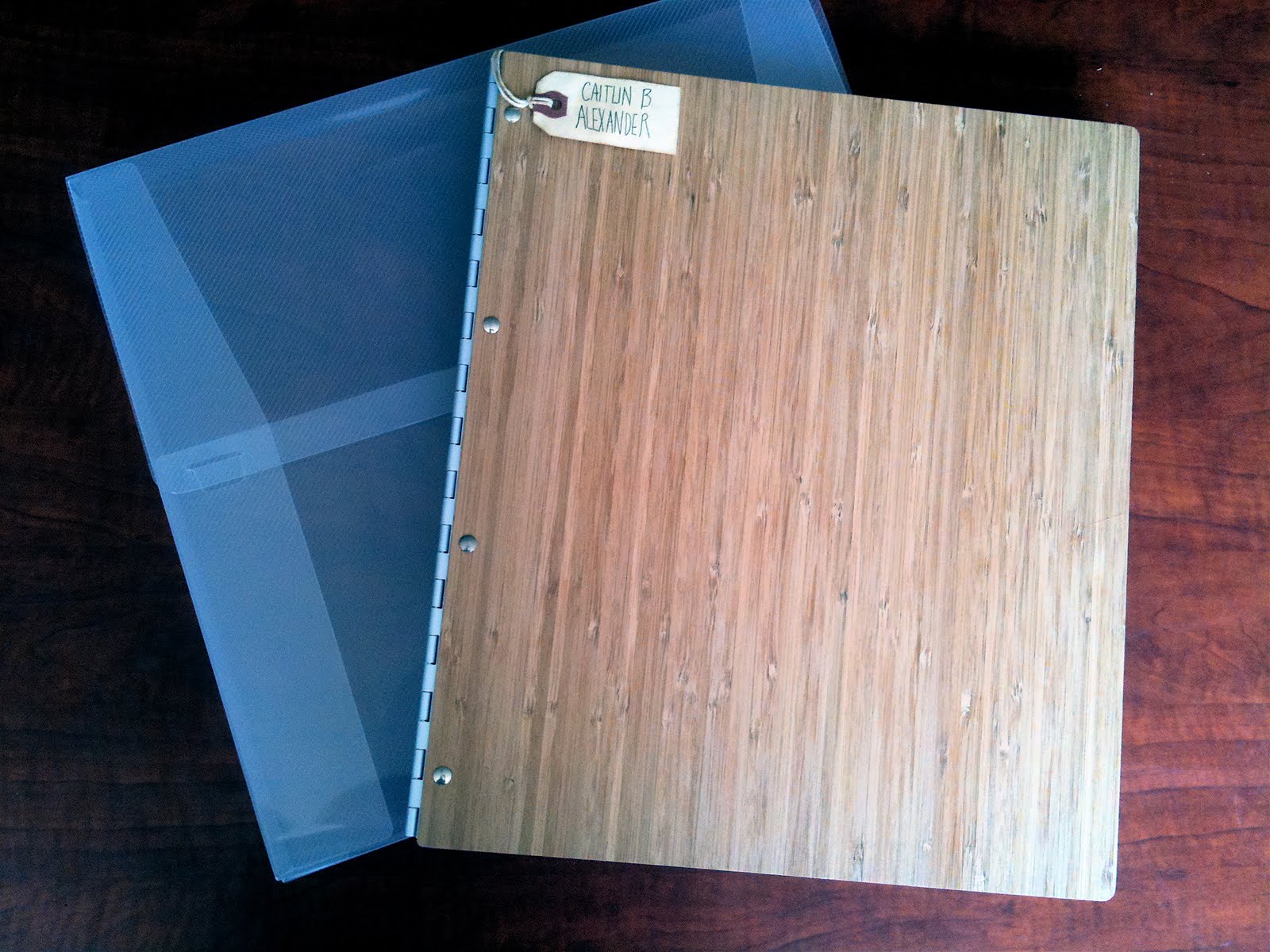
Portfolio exterior and case (so pretty!)

Portfolio first page (my prints all look great, for once! Thank you Gulfstream!)

Another portfolio page, showing the design layout.

My little name tag. =)

Now I am officially professional! Also, quick news: I got my "Rabbit" piece back from Hong Kong, safe and sound, and lookin' good in the frame (which I never saw before!). Finally, I am officially in the 100 Sketches From Life Club from last quarter's Portfolio class.

Oh! And how could I forget? My painting for the mural, which seems like it unfortunately won't happen. Or, at least while I'm in Savannah.


"Counting Mural," Gouache, 2011.

And the last announcements for the day: Thursday, June 2nd and Friday, June 3rd are the senior shows I'll be participating in. Thursday is the Communication Arts Senior Show, and Friday is the Illustration Senior Show. If you're in Savannah, ask me for directions and stop by! There will be lots of pretty art to see.

As you may have noticed, this blog is looking a whole lot spiffier lately! Keep an eye for an updated site sometime soon too...

That's all for now!
adios,
caitlin

Thursday, October 14, 2010

And the work comes pouring in!

I finally have lots of scans to share with you!

To begin with, my first Intermediate Lithography assignment. I believe I already explained how it worked, but I'll give a more detailed account of the project now that there's an image to account for all that time I spent in Alexander Hall, printing away! For this piece, I chose to create a book cover for a competition I found online during the summer. The winner actually gets their illustration printed on the new edition of "The Unfastened Heart" by Lane von Herzen, in addition to $1500 and the Icon Prize. How could I pass up the chance? I read the book during the remainder of those hot weeks before school started back up, and absolutely adored it. Lane has an incredible gift for descriptions, and as I was reading the novel, I had the most lovely pictures in my head. The characters will stay with me for a long, long time.


"The Unfastened Heart 1" I. 1/5 3 Run Lithography Print with Chine-colle, 2010.


"The Unfastened Heart 2" II. 1/5 3 Run Lithography Print, 2010.

Here's my explanation of the imagery from my artist's statement portion of my entry:

"The imagery I created for "The Unfastened Heart" is inspired by several important themes within the book. Most obvious is the bird subject matter. I found the birds who lived in the cages of Anna de la Senda's home to be very symbolic of many events in the story. They were reflections of freedom, beauty, and love. This imagery, I knew from the start, was what I wanted to use for the cover. I chose to have them flying in a round pattern because of the cyclic nature of the story. The message I was left with at the end of the book was one of hope-- although they may never be exactly the same again, things in one's life can be mended. Not everything happens the same way when it comes around again, but the events with each step of growing follow a similar circular pattern. After having come to this conclusion, and after drawing out my sketch as well, I realized that my image is also symbolic of the gathering of loved ones. The Cordojo Women circled around the people they cared for most, in an effort to protect them. I almost view my little birds as those colorful characters."
So, the printmaking assignment. For this project we had to use all the different techniques to lithography we learned in our intro class. It was hard enough just doing one of them! We had to do a stone run (the bird linework), a aluminum ball-grain plate run (my flat green), and a photo-litho plate run (the lettering). It sucked the life out of me, but I am so glad I did it, and I not only survived, but got a pretty good piece out of it too! I had two versions, one with chine-colle, and one without it. I love the paper pattern, but I thought it would be wise to have variation in case I was alone in that opinion. Thoughts, anyone?

Next! My second assignment in my Advertising Illustration class was for a theater show poster. I chose to illustrate "Promises, Promises," a Broadway musical comedy that is set in the 1960s. The time period was my main factor in that decision, being that my work is pretty retro as of late. The concept is pretty basic-- the main characters are constantly attempting to maintain balance and wobble through their lives, and sometimes fall down. I did the parts of the work in gouache, traditionally, and then arranged it in Photoshop. I was having some difficulties with the composition, and ended up needing to remove some of my hand-lettering to avoid awkward tangents. This was my final piece:


"Promises, Promises 1" Gouache and Digital, 2010.

But here's with the text:


"Promises, Promises 2" Gouache and Digital, 2010.

What do you think? Which layout works best? And here's just that abandoned lettering, because I feel so guilty for leaving it out:


"Play Text" Gouache, 2010.

Next up! I did a piece for the SCAD Illustration Club (formerly Society of Illustrators). We are having a show called "Urban Legends" coming up soon. I'll update you with more info on whether or not my work gets accepted, and when the show is. But if you are a Savannahian, you should come check it out!


"Donkey Lady Meets Goat Man," Gouache, 2010.
This is based off two different urban legends (both much scarier than I depicted here.) My mother's friends growing up made her fear a strange lady in town who was said to be part donkey. (Not sure what's so scary about donkeys, actually). And by a strange coincidence, my father made up his own local legend about a crazy, deformed "goat man" in his hometown. I thought it would be funny if these hybrid monsters met instead of my parents. What would their children look like? Hopefully the parallel wouldn't include those kids looking like me... although, my brother and I did resemble chipmunks growing up.

Last but not least! The beginning of my next printmaking assignment: The Exquisite Corpse. This is a game played by artists world wide, where one person is assigned the monster's "head," another its "body" and the third its "feet." Basically, it is just a fun collaboration of styles to create a work impossibly unique. For my first part, I printed the head. This scan unfortunately doesn't do my color scheme justice, making part of the lettering just fade away into the paper. This is a two-run photo-litho print with chine-colle (the umbrella). I really liked how it turned out, so I wanted to give you a sneak peak, since who knows what the monster will look like when it's all over!


"Exquisite Corpse, Part 1" 2 Run Lithograph, 2010.

That's all I have for now. The only other fun news is that we got to see the art director from Rolling Stone magazine speak last night. It was really interesting to find out some of the quirks of editorial. For example, a whole lot more pieces get killed (never put in the magazine) than I thought, and for some strange reasons, like the owner of the magazine not liking a depiction of a person he might be friends with, or that an article is postponed, but for some reason the illustration can't be. It was pretty intriguing!
But I'll stop boring you to death now! Goodnight.
adios
caitlin

Thursday, January 28, 2010

I think I can, I think I can...

Hi everybody! Well, this quarter is stuffed full of art, to say the least. It's going to be tough, but I can't wait to look back on it, knowing I devoted everything I had and did the best I could! Plus, hopefully, I'll have some killer portfolio pieces. A quick update on all my projects and such:

Starting February 12th, I will have my piece "Cat" in SCAD's Poetter Hall for the Society of Illustrator's Humane Society Benefit show. It's for sale, and the proceeds go the Humane Society. If you are in Savannah, you should check it out!

"Cat" 2009, Watercolor and Ink

My first relief print is finished! The composition was originally a tight square around the rabbit, but my professor and I decided it would pop much more on a solid black, and larger background. I used chine-colle to glue the cut-out rabbits onto 30 inch by 44 inch pieces of black western paper. It was a massive undertaking, but paid off quite nicely-- one of the three prints is now hanging in Alexander Hall, and another was held by my professor for the printmaking department.

"Bunny 2/3" 2010, Relief Print with Chine Colle

My pirate piece is complete, as well. I attempted to create an off-register look with gouache paint, and added detail with ink. The colors and symmetry are based off of illustrator great Maxfield Parrish's work. Here's a sample:

©Maxfield Parrish, 1908 "Lantern Bearers"
Here's my final piece:

"Captain Rory" 2010, Gouache and Ink

No finished pieces yet for Children's Book. We have spent the last four weeks on story-writing, spread-planning, composition-making, character-sketching, and layout-roughing. Here are some scans of my character development. This character is Francis, the girl who lives in a city apartment with her mother, and enjoys reading and writing. Her pet is a fish.

Francis as a concept during page layout. The sketches below were added later in an attempt to recreate the original pose.

First pencil sketch of Francis. Very stiff!

More pencil sketches, with newer pen ones next to them, attempting to be looser.

Redo of the layouts- Francis takes more shape, now that I've done a few character design sketches.


Sketching Francis acting as though she would in the book.

Working out the interaction between Francis and her fish.

Finally some color studies (after re-drawing all the roughs large-scale to be traced for the final artwork)! Her jacket will be collage, and the rest qouache paint.

I decided to do the outlines in a color relative to what it would be surrounding. The colors here aren't exactly right since I wasn't using a very good scanner, but you get the idea. My, how she's grown! And to think I haven't even begun (and have five other kids! Eesh!)
So much for this being quick. Oh well. Time for bed!
adios
caitlin