Tuesday, June 1, 2010

Printing a Lithography Stone

Hello All. One last post for today.

I thought I would explain the very complicated process of Lithography stones. This will be lengthy, so bear with me! And don't try this at home (mainly because you won't have access to hardly any of these supplies).


First, you pick a stone. This one was my friend; I used it for every stone assignment in the class.


Then you have to grind the stone down with a levigator. I unfortunately don't have any pictures of this process, but it involves varied sizes of grit, a spray hose, and the levigator itself- a heavy, round wheel with a handle you spin over the grit, to smooth down the stone. This eliminates the old image on the stone and levels it out.


Next, you transfer your drawing onto the stone.


I used autographic ink to recreate the image. This ink is one of several greasy mediums that can be used on a lithographic stone. This needs to sit overnight.


Next is the first etch. This is a dangerous step, so you need to wear a mask and gloves!


After preparing the workspace, brush talc and rosin over the image to solidify it.


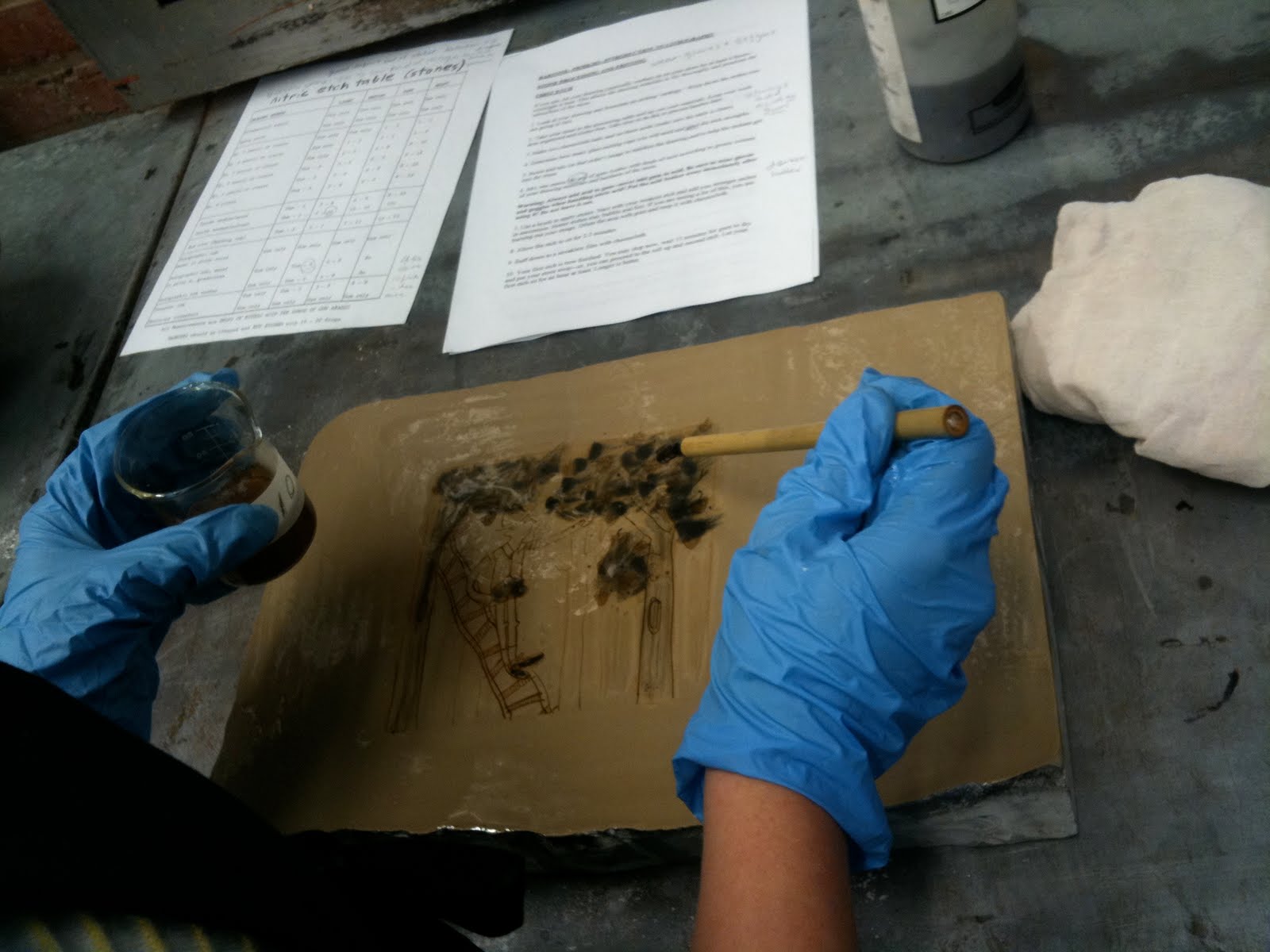
Then you made the etch mixture. First pour gum arabic into the etch glasses. Then add drops of nitric acid; the more drops the hotter the etch. I used this chart to figure out how much acid to use.


Apply the etch with a brush.


Let it sit, and then buff it down tight with a rolled cheesecloth.


This needs to sit for at least an hour, during which, you can set up for the second etch.


Set up 1803 ink, water bowls, and sponges.


Wipe out image with Ispoar G.


Rub asphaltum over image (this is where I probably ruined it- you aren't supposed to use as much as I did here).


Charge up roller, and then wash out the asphaltum with a dirty sponge.


Wipe stone with clean, damp sponge, then roll two passes of 1803 ink, then recharge the roller. Repeat this until the image is dark.


Fan dry the stone.


Talc and Rosin again.


Repeat the etch steps again.


Set up the press. Make sure the stone is in the center, up against the woodblocks, and lined up with the scraper bar.


Tear your paper, and set up the marks on the press that tell you when to put the pressure on and off.


Roll out 2244 ink.


Wash out image with Isopar G again.


Rub asphaltum again.


Wash out with dirty sponge.

Now repeat the clean sponge and ink roller passes. Here's a video of me printing at Open Studio Night:


Whew! The end!
adios
caitlin

Lots of Art!

Hello again.
Sorry I haven't been so great about updating lately. After midterms I was so busy with the end of the year, packing, storage units, job hunting for the summer and getting ready for New York, I just couldn't manage to squeeze blog time in! But now I'll squeeze all that was missed into a couple blog posts.

First off: my second Lithography assignment! This is a two plate run, and a rather large print. These are aluminum plates, which require a lot more processing than the pronto plates from the first assignment. One run is the brown line work, done with Litho Crayons, and the second (yellow) created with washes. Overall, a pretty successful but not quite portfolio-worthy project.


"Catnip" AP, Lithograph Print, 2010.

Moving right along! Kellan and I, as mentioned previously, were participants in the Sidewalk Chalk Festival. No luck again this year as far as winning goes, but we had fun with it, as usual, and got a lot of good feedback from the people walking by. The weather wasn't as good this year, but we stuck it out, and it was certainly worth it!


The proud artists!


The final product! Children playing pirates in a treehouse with their imaginary friend.


Me working on our piece.

An interesting thing happened to me when I went into Panera for lunch with my roommate Maria a few weeks ago. The cashier, when I handed her my card, said "Oh! You're Caitlin Alexander!" I was pretty confused, and agreed with the statement- yes, that's my name... She then went on to say, "You're really good!" I had no idea what she was talking about, and it was pretty clear, so she continued, "You're illustration, right? I've seen your stuff, it's awesome! You have a boyfriend, Kellan, he's good too!" My department is pretty small, and I didn't know this girl from any of my classes. Needless to say it was very flattering to be recognized by my name as an illustrator! And she even knew about certain details of my life. Celebrity status, woo! Just kidding, but it was pretty exciting.

The third assignment in Poster was very frustrating for me. I actually did the project twice, starting over a day before it was due because I was so unhappy with what I made. I still wasn't thrilled about the final result, but it was better than what I had in the beginning. It is a poster for a band called Horse Feathers. The event in New York is real, and I wanted to show the concept of a indie-folk band taking over the big apple. Here, the chickens are coming out of an apple, like worms. I feel as though my color choices here are poor, and the composition was difficult to understand. A lot of people didn't see this as an apple, and I didn't like the aesthetics of the chickens.


"Horse Feathers take 1" Gouache and Photoshop, 2010.

In the second attempt, I limited my color palette, and removed the harsh orange. I made the chickens more readable, and the top of the apple makes a more iconic image. I used watercolor paper instead of bristol to help with the texture, making my technique a lot better here. I am not, however, as fond of my hand-lettering in this work. I think it looks a little sloppy and rushed (because it was) and, as nice of an idea it was to use the leaf for text, I didn't get it working quite right here. Oh well, learning experience!


"Horse Feathers" Gouache and Photoshop, 2010.

I actually started over my third Lithography assignment as well, although I don't have any scans of the first attempt to show you. This was less of my fault as an artist and more of my fault as a chemist. One of the many steps of the stone process I managed to goof up, and my first print filled in really badly. In a post following this one, I will give a step-by-step of the stone lithography process. So, I started over, and came up with this simple little illustration. The colors are done by hand, not print, with watercolor. The drawing on the stone was done with autographic ink.


"Too Many Dogs" AP, Lithography Print with Watercolor, 2010.

I was actually printing this edition (I pulled a grand total of 21 prints!) during Open Studio Night, where I also had working hanging for sale. I was essentially a demonstrator of lithography, and had people asking me questions about the process. It was a lot of fun, and I'd love to do it again.

I finished my final Litho print as quickly as I could, since I knew I had so much more work in other classes to do. This is also with autographic ink, but there is another run of monoprinting for the the balloon colors and background blue. This is when a printmaker basically paints on a sheet on plexiglass with ink, and then runs it through the press. To get a consistent edition this way is very challenging. The chine-colle (basically collage glued down as the paper is run through the press to print at the same time) of the balloon was done with the linework. It was thought, after seeing these results, that the work still seemed incomplete, and I was considering hand-coloring a little bit of it (which I did do with the hats later), when one of the printmaking professors came in with a box of goodies, showing us little tricks. I tried out her craft Martha Stewart flocking powder out, and it actually balanced the piece perfectly! Flocking powder, in case you aren't familiar with it, is a powder, that once glued down, feels like a fake velvet texture. Very retro greeting card. I love it!


"Balloon Brigade 2/3" Lithography Print with Watercolor and Flocking Powder, 2010.

I had three works in the juried show Alexander Ink at the end of this quarter. Two of them were in the main gallery, and I even got the "Sentient Bean Award" for one of them. The printmaking department announced my name as Caitlin Anderson, though, which was a little awkward. Oh well!


Me with my works in the main gallery.


My other piece framed.

I decided that I really needed to pull out the best work I could do for the final in Poster. I had to redeem myself after that Horse Feathers piece. I looked a lot at the work of Mary Blair and other 1950s illustrators, and carefully worked on this poster for a documentary. I am very pleased with everything about it. I think I finally hit the nail on the head here with the painting style working with the subject matter, and my hand-lettering. And I think the professor agreed! He was a difficult one to please sometimes, but I'm pretty sure he liked this one from me.


"Died Young Stayed Pretty" Gouache, Pencil and Digital, 2010.

And finally, I had to do a piece for the New York trip coming up. I reviewed my portfolio with my professor, and he told me that I have a style for people (gouache) and a style for animals (printmaking), with crossover between (people in printmaking), but I needed something of animals in the people style. So I came up with this! I had been dying to do a piece with a city backdrop, and it was kind of wonderful to have freedom in what I wanted to do (but not too much! That usually ends badly for us illustrators. We need just a little direction to find our own creative method within). I am very happy with this piece, too.


"Worm!" Gouache, 2010.

I also had some work in a Litho show with my class called "Polyautography: Science of the Handmade." It went well, and I even traded prints with some of my classmates. Hooray free wall decor!

And Ancient Art and Architecture, well, was difficult to say the least. Lots of memorization, and in that sense, kind of the art history class from hell! But I pulled it together and ended up getting an A in the class. All A's my entire Junior Year! I have been on the Dean's List my whole college career so far and have a 3.88 GPA. Let's just hope I can keep it up for three more quarters! In the fall I am taking Introduction to Psychology, Humorous Illustration, and Intermediate Lithography. But before then I have a few months off, and a trip to New York to show some important folks my portfolio. I am very excited and nervous. And I will update you again on how the trip goes!
Have a fantastic and lovely summer!
adios,
caitlin

Wednesday, April 21, 2010

Long time no... write.

Yikes... Sorry it's been so long! I got caught up in being busy the last few weeks and didn't have time to upload the scans of my artwork. So here's an update on everything I have been up to.

Kellan and I did get into the SCAD Con Artist's alley a couple weekends ago. It was a really good opportunity to get our work out to the public, by way of business cards, portfolios, prints, and original work. It was in conjunction with the Career Fair, which we also participated in. I showed my portfolio to a few companies and got some pretty good feedback. First I talked to Odopod (www.odopod.com). The man was very kind and sincere, but did say that they had been somewhat falsely advertised and weren't really looking for illustrators as much as artists of a more graphic nature. He did, however, take a card of mine (I used postcards instead of business cards because they catch a client's eye more, and they can stick it on their bulletin board for future reference. I also made several different kinds displaying different styles I am capable of, allowing them to choose.) and he seemed to enjoy getting to pick one. Then I talked to Gallopade International (www.gallopade.com) who work with children's materials, including literature and products for schools. The woman was very nice, although rushed because of the long line, and told me that they may be interested in my black and white line work. She gave me what they called a "free pass" for SCAD artists, and told me to contact them for either freelance work or internship opportunities. She took a postcard and a copy of my portfolio. Next I spoke with people from Wild Apple (www.wildapple.com), which is a company that creates artwork to be sold to home decor lines. I really love their stuff- gorgeous floral patterns are right up my alley! She seemed to like my work, took several postcards, a copy of my portfolio, and suggested I try for an internship (which I did apply for later). And I got a free bumper sticker reading "buy art!" I felt very comfortable with these people. If I don't end up working with them at any point, I know I'll at least be a fan of their product! Lastly, I talked with a woman from an animation studio, which I believe was simply called "The Studio." The line to see her was over an hour long, and people were not getting good reviews, but she surprisingly liked my work very much. She said that although it didn't fit what they need, she was personally inspired by my illustration (claiming to even "love" it! a rare word in these situations) and took several of my postcards for her bulletin board. She was very nice, and even though I won't be getting any career relations from that interview, it sure was a confidence boost to get feedback like that! So, after a long and informative day, Kellan and I were just about to pack up, when we were told by the man in charge of SCADCon that corporate employees from Scholastic had been there. We waited a little while, hoping to get to see someone, but alas, no one showed. The really wonderful SCADCon coordinator took a copy of our portfolios to give to the Scholastic people and said there would be a good chance they'd be back next year. Something to look forward to! All in all, it was a very successful day.


Me with my table at SCADCon!

Last week, we went to a lecture about the future of illustration and graphic design with the upcoming technology. The illustration and graphic design departments had some really incredible guests to speak: Bridgid McCarren, Cristoph Niemann, Tyler Darden, Christopher Sickels, and most impressively, Yuko Shimizu and Anita Kunz! It was a very important lecture, and made me proud to be involved in the word of illustration. There are a lot of inspiring people in the field.


An illustration by (and copyrighted to ©) Yuko Shimizu.


A depiction of Martha Stewart by (and copyrighted to ©) Anita Kunz)

Other news: I entered my Big Bunny from Winter quarter (look back in the entries or on my site to see it again) into the Spring Open Studio for printmaking. It'll be for sale, if anyone wants to spend a bunch of money on an awesome one-in-three-kind print!

More exciting news: I found out last night that all three of the prints I submitted into the Alexander Ink exhibition were accepted! Two of the three will be displayed in the main foyer, while the third will be in the printmaking gallery space. This is a pretty big deal, considering the juror chose less than half of the entries to hang in the show! Two pieces you may recognize from last quarter: "What Will You Strive for in Your Life?" and "To Love Any Art Form." Look on my site or back a few entries to see them again... or better yet, come by Alexander Ink in May! And what is the third piece, you may ask? It is something new! I bet you were waiting for that.


"When Nini Meets Clarence, 2/3" Lithograph Print, 2010.

This is my first assignment from Introduction to Lithography. We used pronto plates for this assignment, and here I have used a total of three-- one for the yellow, one for blue, and the last for black. The image was originally scanned from a pen drawing. I know I said I would attempt to explain the steps of lithography, but now I think I might change my mind. It is a very, very complicated and confusing process. Maybe I'll take pictures during my next assignment of the process... no promises, though! I just turned in my second assignment today, which I haven't scanned yet. It's done on an aluminum plate, and next we will be using stones. Very exciting stuff! Oh, and what's this? More new art? Hurrah!


"Whales," Gouache and Digital, 2010.

Did you know that there is a sanctuary for fin whales and striped dolphins in the Mediterranean governed by France, Monaco, and Italy? Did you also know that this "sanctuary" is not being treated as sacred in the least, and tourism, trade traffic, and gas treatment plants are all really placed in this area? And would you guess that because of these things, the populations of these aquatic species are dwindling quickly? I didn't either. That's why I chose this subject for my social awareness poster. This image will be entered into two separate poster contests-- one online and one with the school. Hopefully this image will be going places!

Well, not much to show you in Ancient Art and Architecture, although I could write another paper on the comparisons and contrasting elements of the Orientalizing Period's "Maiden of Auxerre" and the Archaic Period's "Anavysos Kouros." Doesn't sound appealing? Didn't think so. It actually is very intriguing subject matter, though. I just have a hard time remembering all the Greek terminology! I had my midterm yesterday, though, and I think I did pretty well. Hopefully all A's so far!

Other than that, not much else is happening. I'm trying to figure out what classes to take in the Fall, but there aren't too many options now that I only have three quarters left (eek!). I'll give another update after sign up. And this weekend is the Sidewalk Festival! Kellan and I are sharing a space, just like last year. I hear a rumor that the people from Cartoon Network are judging, so maybe we stand a chance! Pictures will be posted later.

That's all for now! If you made it this far, kudos!
adios,
caitlin

Monday, April 5, 2010

First Project of the Quarter!

Hey everyone!
Spring quarter is finally picking up some speed, as my first assignments come to a close. Unfortunately, I only have a scan of one of them, but the other will be coming soon! This is a movie poster for my Poster Design for Illustration class. I chose to re-work the design for "Away We Go" because the poster released had a fantastic little, busy doodle in the background, but then some terrible Photoshop effects on an image covering it. Due to the fact that I don't know who to copyright for the image, I'm going to avoid putting it on my blog, but just Google-search "away we go poster" and it should come right up. Sorry for being lame like that. Here's my interpretation:


"Away We Go" 2010 Gouache and Digital

I think the concept is pretty straightforward. The main characters are presented clearly, and in the background are images that symbolize people and places they encounter on their journey to find a home. Everything is hand-drawn and painted, but compiled and tweaked on Photoshop. I got it printed for the class today at a whopping 22 by 30 inches! It's certainly shocking to see your work at that scale! I'm pretty happy with it, although I think the composition suffered a little because of it's complicated nature. I was really inspired by illustrator Nate Williams for this poster. His artwork is fantastic and fun, and his hand-lettering is to die for! Here's a sample of his work. Check out more of it at http://www.n8w.com.


"Beautiful Life" © Nate Williams

Other news: I won third place for the CSSS image competition! Yippee! (Look back a couple entries for my piece-- it's of a girl wearing water wings). I got a 25 dollar gift card to the Gryphon Tea Room, which was immediately spent on some delicious sandwiches and sweet potato fries.

I am trying for an additional off-campus program scholarship to help pay for this opportunity that my parents so kindly agreed to let me participate in. I am finishing up the application now, and am keeping my fingers crossed!

Also, my large "Bunny" print will be for sale at the printmaking Open Studio show! It will be in May, and if you are a Savannah resident, you should definitely stop by! There will be some pretty intriguing demonstrations at this already-awesome show.

Possibilities: My boyfriend (and fellow illustrator) Kellan and I are trying for a table at SCAD's Artist Alley, a part of SCAD Con and the Career Fair. It will be a great opportunity to get our work out there to other students, alumni, and, most importantly, professionals. I sure hope it works out!
Also, I'll be entering the juried show "Alexander Ink" in the next couple weeks, and am keeping my fingers crossed on that as well. More updates soon.

Lastly, I just want to say congratulations to Kellan for his interview/portfolio review with Pixar. He was chosen from many (and was one of a few) who got face time with employees from the incredible company. He is trying for an internship there this summer (his interest would be in character design) and I am wishing him the best of luck! He sure does have a leg up, now that they've met him. And don't let his modesty fool you if you talk to him! It's a really big deal!

That's all for now.
adios
caitlin

Tuesday, March 30, 2010

A slow start

Hello all! I am mid-way through the second week of the quarter, and not a lot has happened just yet. I think spring break was too short, because I've had a hard time getting really excited about my classes so far. Not that I dislike them, I just still have those lazies left over! I am taking Poster Design for Illustration, Introduction to Lithography, and Ancient Art and Architecture. I was least excited for Ancient, but I'm pretty interested so far in the reading material. The Minoans were a really amazing group of people, with a pretty sad ending. They weren't particularly interested in battle or hunting the way mainland Greece was, and had a great love for the sea. They seemed quite the peaceful folks, and then a tsunami wiped out a good portion of Crete, allowing what was likely mainland Greece to come take over. The thing they loved most ended up being their demise. Pretty tragic stuff.
I don't have any art yet to show you, but I can give a quick update on what we are starting. In Poster, we are working on movie posters, and I have chosen to illustrate Away We Go. I love that movie! Anything with a group of ridiculous characters and a journey, and I'm in. If you haven't seen it, you should rent it for a good laugh. In Litho, we are starting out with Pronto plates. The steps involved are really difficult to explain, so when I post the piece, I'll try and give you a run-down for it. My imagery for it is going to be reminiscent of the "Cat" piece I did a little while ago.
That's about all for now! Here's an old piece to tide you over:


"The Wilson Brothers Get a Treat" 2009, mixed media

Not much like my current stuff, huh?

adios,
caitlin

Thursday, March 11, 2010

And so ends the most challenging quarter of my college career!

Hola!
Today was the last day of classes for the winter quarter of 2010. I can't believe I only have four more before I'm out of the nest and out on my own! What a scary and exhilarating thought... I'm really looking forward to the rest of school (this quarter I think was the beginning of the best classes yet) and looking forward even more to starting my life as an illustrator. I feel like all my little ducks are lining up just perfectly right now. It's official-- I'm going to New York this summer with SCAD for a week! We don't have a set itinerary just yet, but I will fill you in on all the juicy details as soon as I find out. I know we will be visiting big-name companies, meeting successful illustrators, showing off our portfolios, and seeing amazing artwork. It's going to be career and life changing! I can't wait. Also, I'm really pulling together my different styles now, and will be changing my website (yes, again) at the end of next week to fit those needs. I have about four styles going, but often they overlap-- printmaking (loads of patterns, usually relief prints), collage (strange papers and textures), flat qouache (vibrant colors and nice movement) and off-register qouache (pretty self-explanatory). I can't decide yet how I want to break up my website. Currently, it's by field of illustration, but I'm wondering if perhaps all my images should be on one page, or even broken up by style instead? Any thoughts?

Anyway, here's the last piece I did for the quarter. It's for a mock-up Rolling Stone cover. Mine is for Elvis Costello: Master of Wordplay. Get it, Scrabble is a word game? Har har. I'm so clever.


"Elvis Costello" 2010 gouache and ink

So I'm off for the week for some relaxing fun in this nice, new, warm and lovely weather! And when I come back, I'll have a brand-spanking new website, and three brand-spanking new classes.

NEXT TIME, ON JUST SOME ART, BY CAITLIN ALEXANDER:

WILL THE EIGHT-AM POSTER DESIGN FOR ILLUSTRATION CLASS BE TOO DIFFICULT TO WAKE UP FOR IN THE MORNING? UNLIKELY, CONSIDERING CAITLIN HAS HAD AN EARLY CLASS EVERY QUARTER.

AND WILL INTRODUCTION TO LITHOGRAPHY BE ANYTHING SHE EXPECTED? HARD TO SAY, SINCE SHE HAS NO IDEA WHAT TO EXPECT.

AND LASTLY, JUST HOW BORING WILL SURVEY OF ANCIENT ART AND ARCHITECTURE BE? HOPEFULLY NOT AT ALL, SINCE OLD STUFF IS COOL.

SEE YOU NEXT WEEK, ON JUST SOME ART, BY CAITLIN ALEXANDER.


Wow... time for bed.
adios
caitlin

Monday, March 8, 2010

I got my books in the mail today!

Hey everybody! Just a quick post to let you know that I got my three copies of "Which Pet?" today in the mail, and Blurb did a fantastic job on printing them! The colors are perfect and there is minimal cropping of any images.


Running off to class now!
adios
caitlin

Saturday, March 6, 2010

Wrapping up winter quarter

Hello all!

I've been working like a madwoman this week on finals-- it's probably been the hardest quarter yet! Luckily, I am done with two classes, and just have a little left in the third. I am still waiting to receive my book from Blurb. The package tracker said it arrived in Savannah yesterday... and yet, I haven't received a notification from SCAD's mail center. I really hope it hasn't gotten lost in the shuffle! Printmaking, as of this afternoon, is finally over! And I even have scans of my last two prints.


"What Will You Strive for in Your Life? 1/3" Relief Print, 2010.


"To Love Any Art Form 2/3" Relief Print, 2010.

I hope it's apparent that the two images go together. It's somewhat of a narrative-- the little girl asking a bird a question, and his reply. I wanted to do something a bit more within my illustration style for these pieces. The second work actually was the first one I made, and at that point I truthfully didn't really know where I was going with the concept! Only after I completed it did I know what I wanted to do. Both used multiple blocks and stencils. Printing in color isn't nearly as simple as painting in it! Because of the numerous colors and registration on each block, each piece had to run through the press many times. "Strive for" ran through it six times, and "Art Form" went through nine. That's a whole lot of printing considering these are editions and there were six attempts with each... I guess that would make 87 runs through the press (since one of them I didn't complete due to really poor registration). Yikes! A lot more complicated than it looks, huh?

Really quickly, I made a piece for the Counseling and Student Support Services' image competition. It's pretty bold, which is nice, but my favourite thing about it isn't the aesthetic as much as the concept. CSSS keeps you afloat when you feel like you can't tread water any longer!


"Let CSSS" Gouache and Digital, 2010.

That's all I have right now for you. I still have a whole piece to do (and a paper to write) for Survey, so expect another update soon!
adios
caitlin